Visual Analytics
Visual analytics is “the science of analytical reasoning facilitated by interactive visual interfaces.” - Wikipedia.
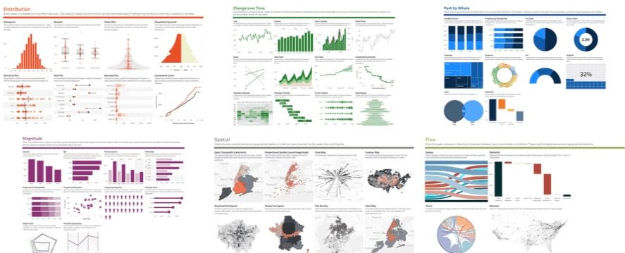
This rather dry phrase disguises how useful Visual Analytics is. Why? Because people are much better at understanding complex patterns and relationship if they can see them rather than just reading a list of numbers ... but more of this later. In fact it's so useful that I've devoted a whole page to it, the one that you're reading now 😊
In Tableau terms, Visual Analytics is often used to indicate Visual Design Best Practices, probably because of the excellent Visual Analytics course that Tableau runs, which in it's description says ...
“You are an experienced Tableau user who wants to learn more about best practices for displaying information and insights in Tableau.”
This page is going to cover some of the basics of visual analytics (and visual best practices) and how we can apply them in Tableau to build great visualisations. It is not a replacement for the Visual Analytics course from Tableau, which takes 2 days to deliver, covers the subjects in depth, and anyway I can't type that fast 😊.
To keep this page to a sensible length, it is supplemented by a series of blog posts. You can find these posts by using the Visual Analytics tag. It also makes it easier for me to write as I can write it in chunks rather than trying to do it in a big bang approach. As any creater will tell you, Big Bang approaches take a long time to complete (13.8 billion years and counting) and often get bogged down in the details.